Description
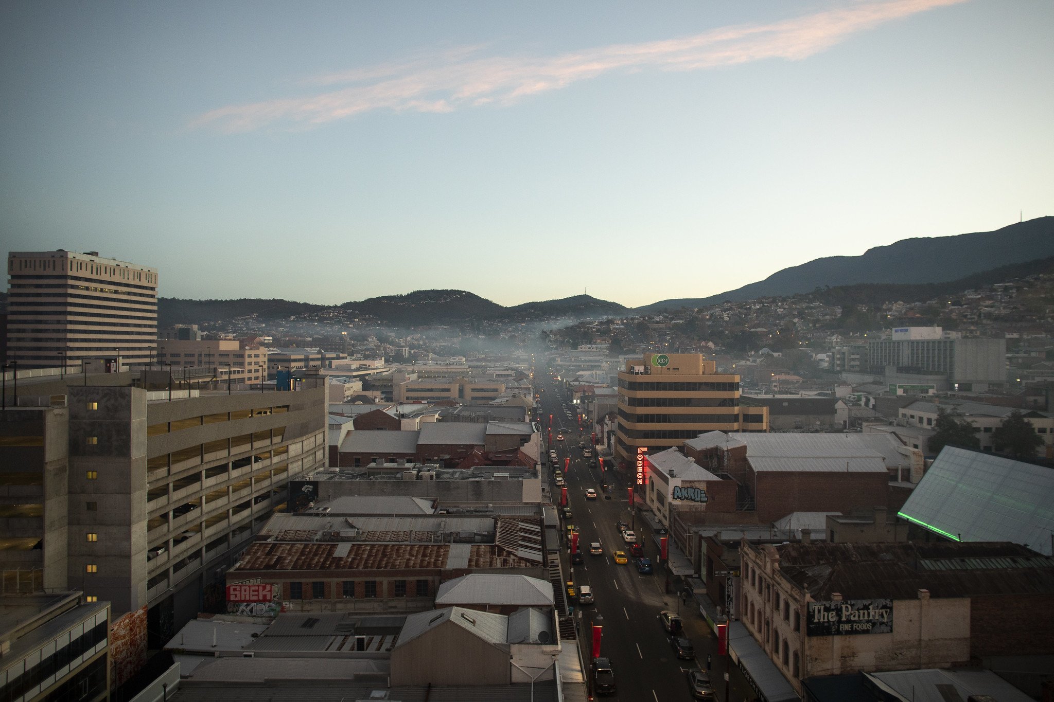
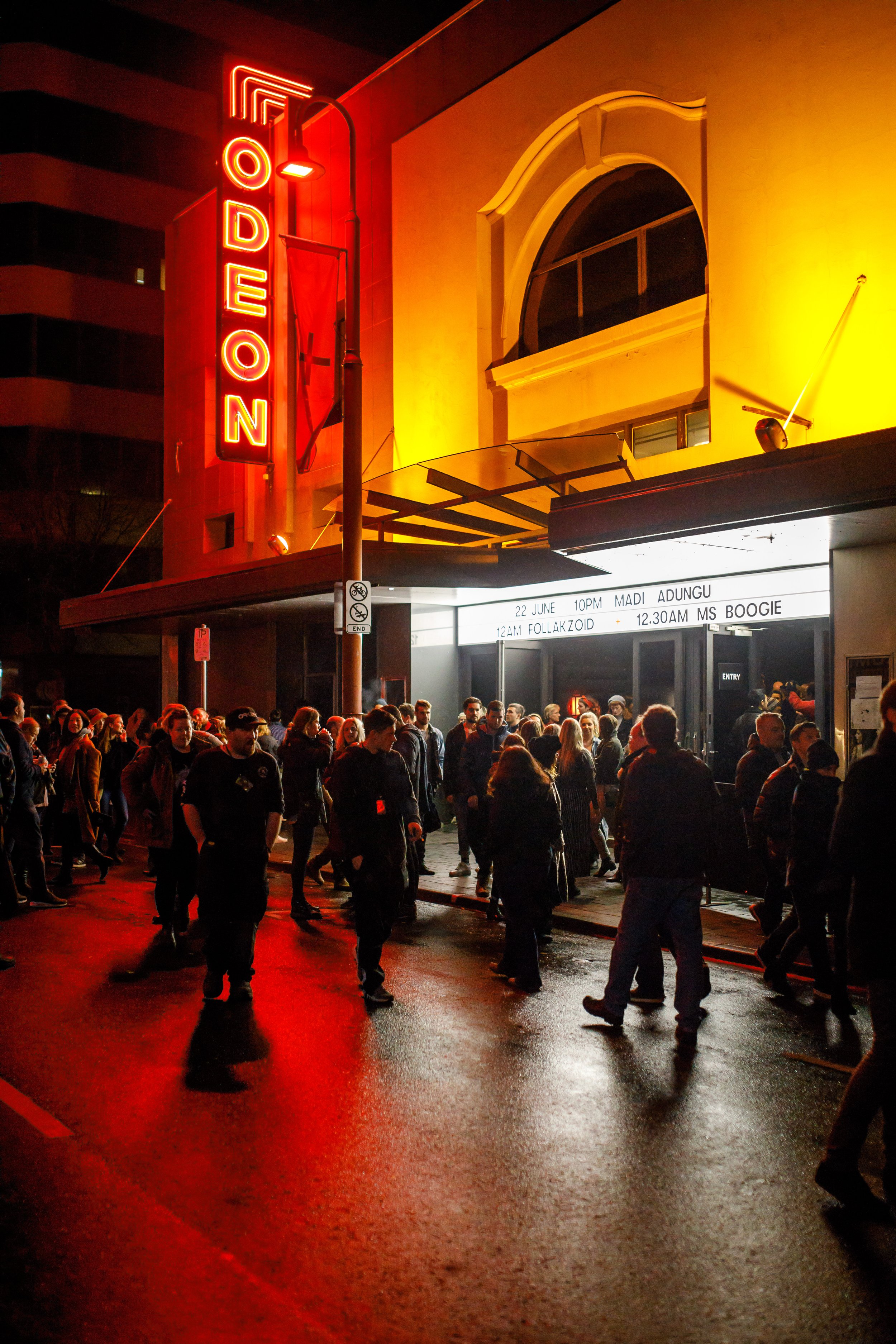
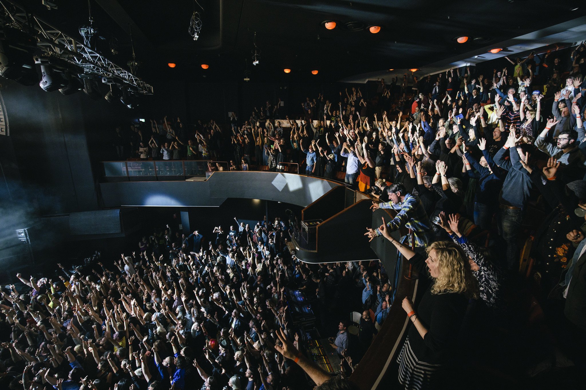
As the lead designer collaborating with Odeon and DarkLab, I spearheaded the creation of a vibrant brand identity that authentically encapsulates the spirit of this historic venue. Situated in the heart of Nipaluna/Hobart, Odeon stands as a timeless testament to live music and performance, dating back to its establishment in 1916. Drawing inspiration from the architectural marvels of New York's theaters from the same era, our design harmoniously melds the venue's rich heritage with the dynamic essence of modern Hobart.
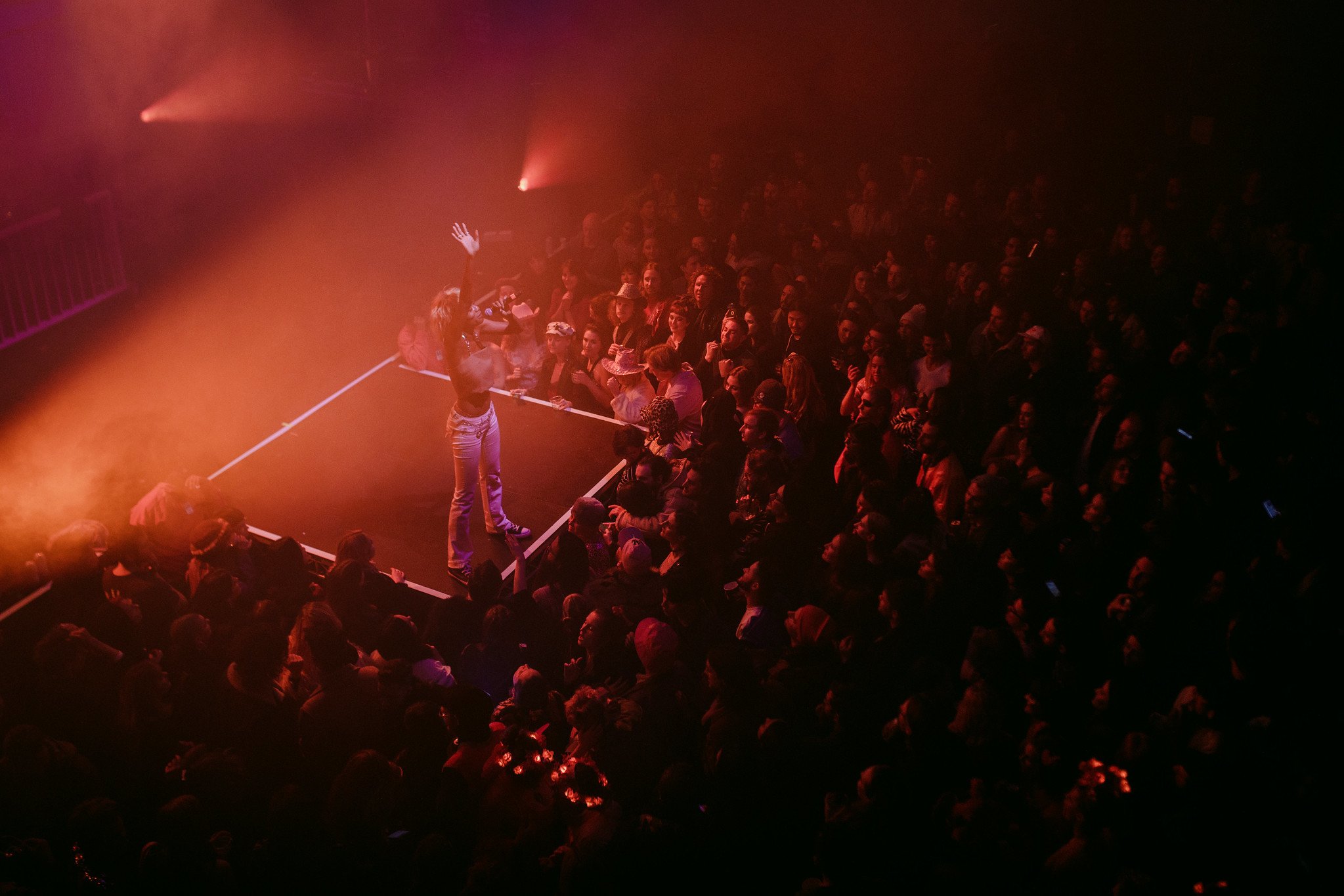
At the core of our vision lies a deep reverence for the arts and the vibrant community it fosters. Our goal was to not only pay homage to Odeon's storied past but also reimagine it for contemporary audiences, infusing every element with a sense of innovation and relevance. From logo design to promotional materials, every aspect of the brand identity reflects our commitment to celebrating Odeon as a cultural hub—a space where new experiences in live music and performance thrive.
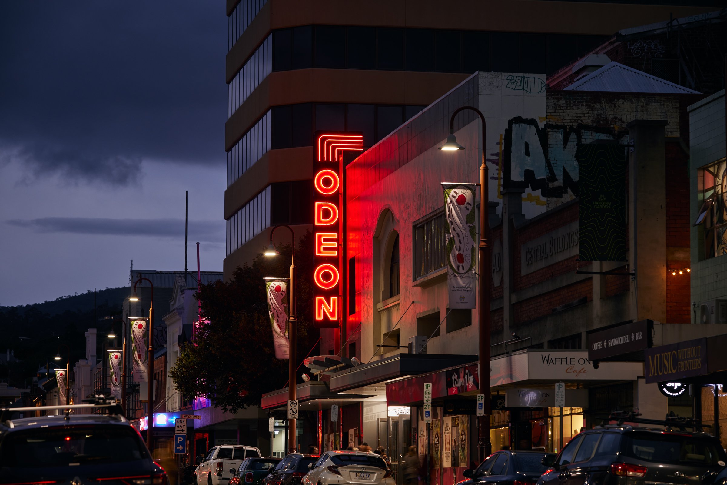
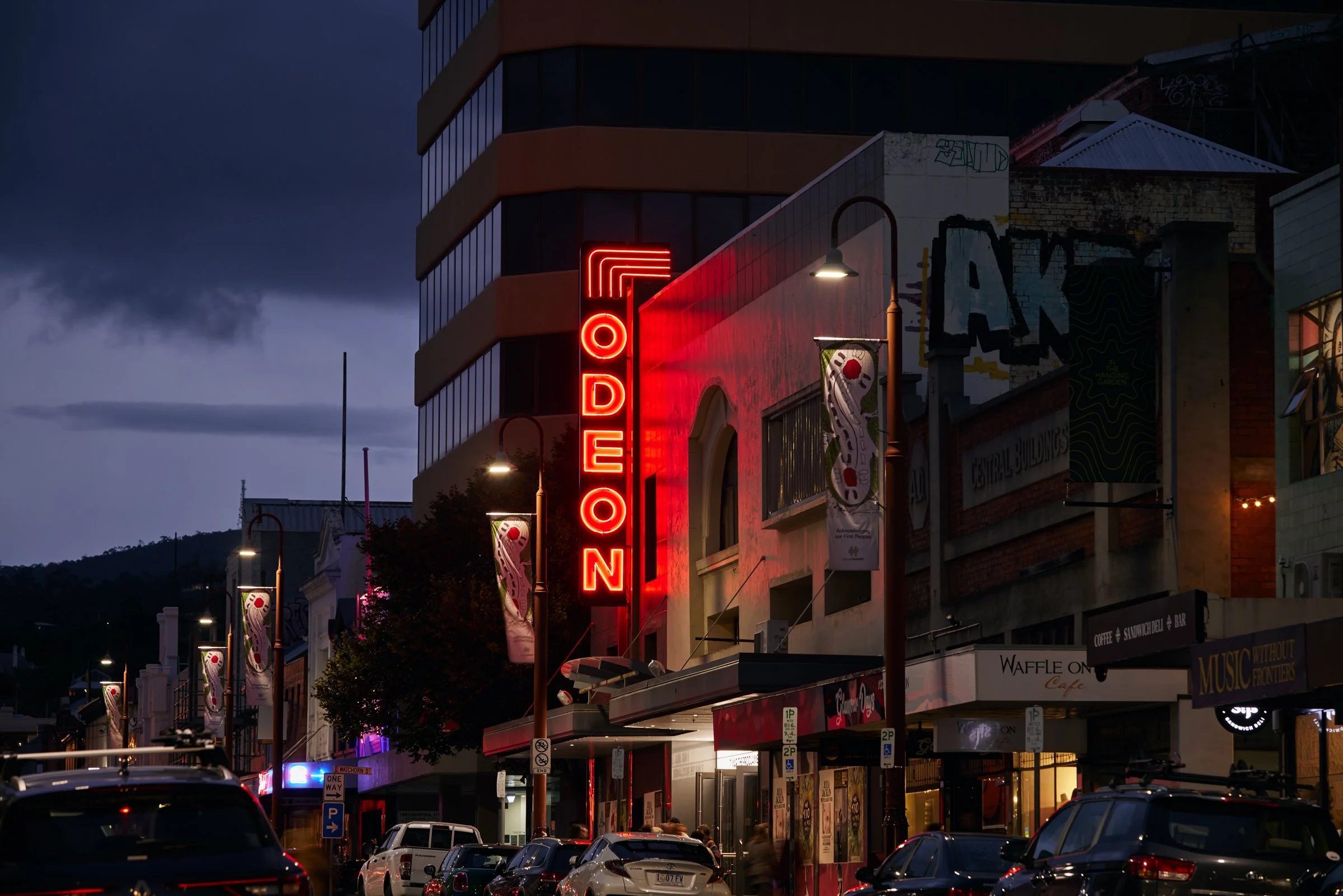
The cornerstone of Odeon’s identity is its logo—a custom typeface meticulously crafted by type designer Vincent Chan, inspired by the venue’s exterior neon sign. Chan's work involved adapting the original vertical orientation of the sign to a horizontal layout, ensuring legibility and aesthetic coherence. This process included adjustments for vertical overshoots, letter proportions when read horizontally, counterforms, letter widths, and overall balance. The result is a bespoke typeface that captures Odeon's history while infusing it with contemporary flair.
Project Info
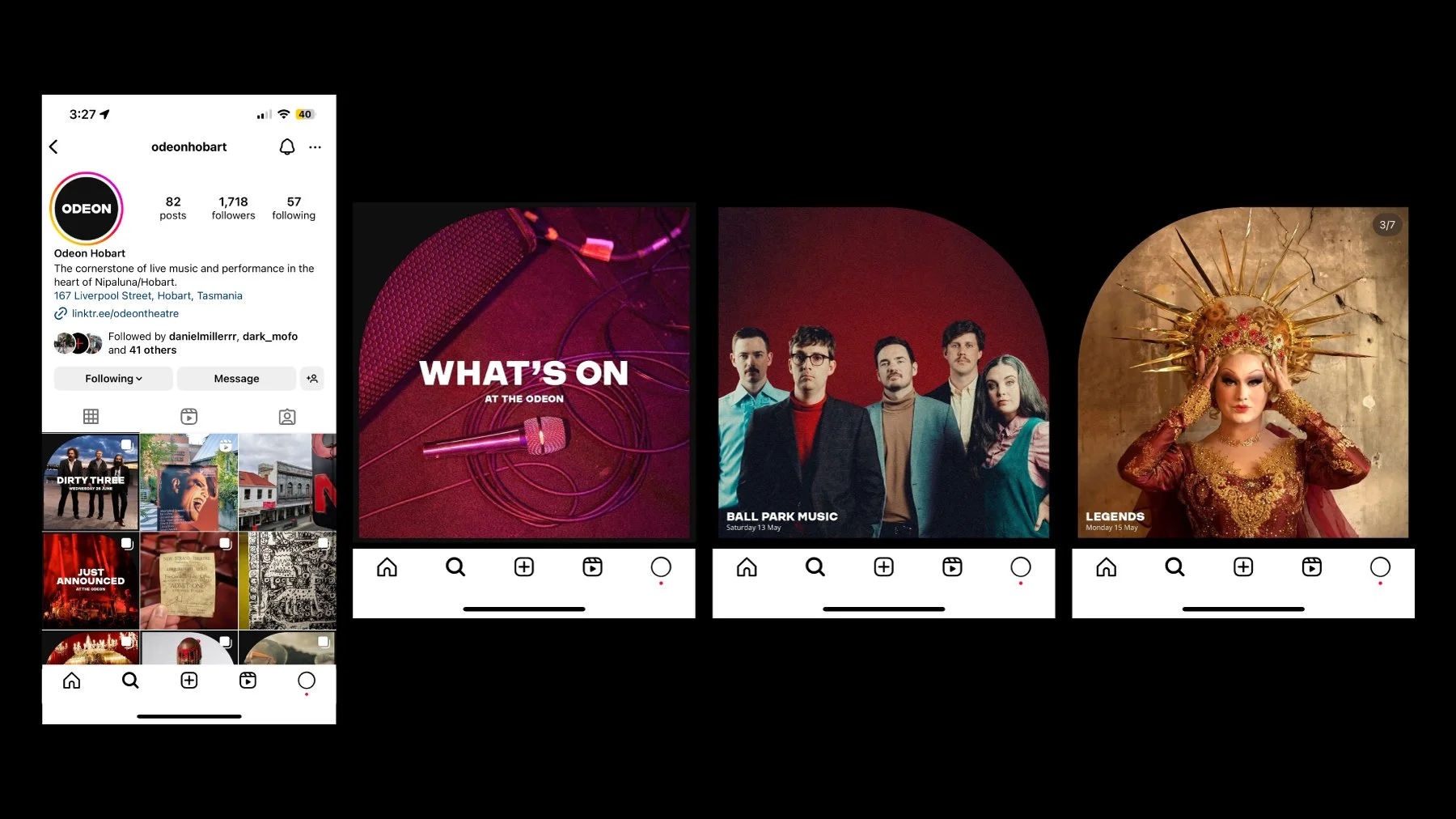
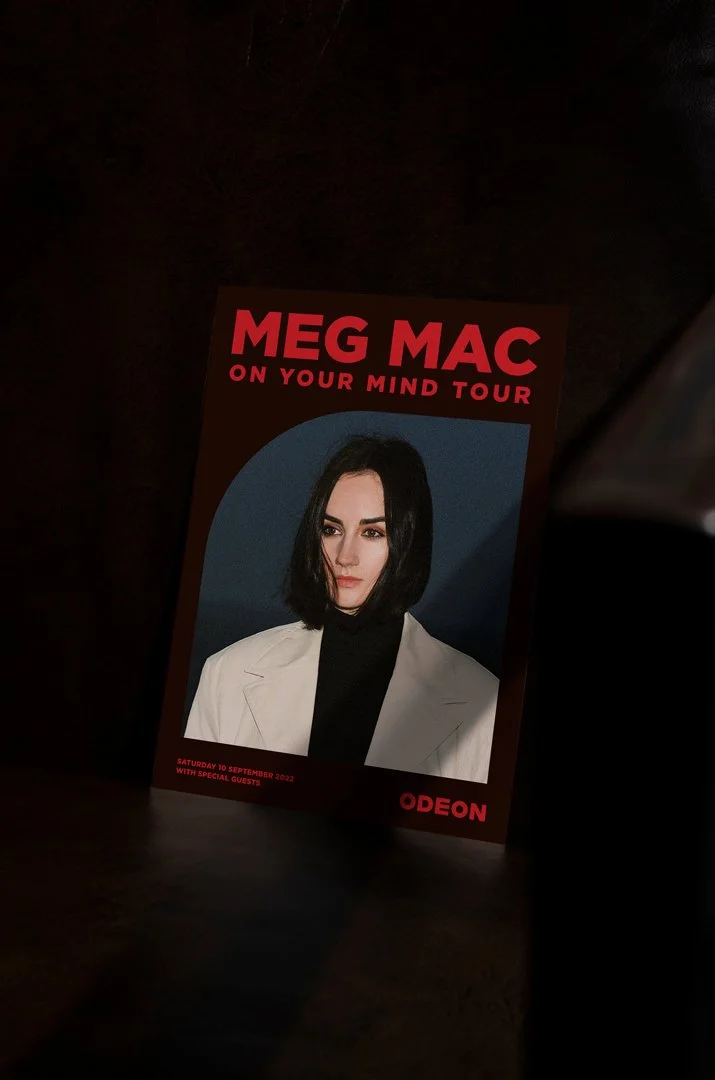
The graphic elements have been inspired by the buildings 1930s facade design, incorporating the geometric window shapes and stage design. Creating a visual language that pays homage to the historical detailing. The reproductions of these shapes can take any form but should always use curved edges.
